3.3 Plotting Sample Statistics from an ArchRProject
When working with multiple distinct samples in a single integrated data set, it can be important to compare various metrics across all samples. ArchR provides two main plotting mechanisms for grouped data: ridge plots and violin plots. These are both accessed through the plotGroups() function. Of course, this plot type is not limited to sample-level data and can be used for plotting of downstream group-level information for groups such as clusters.
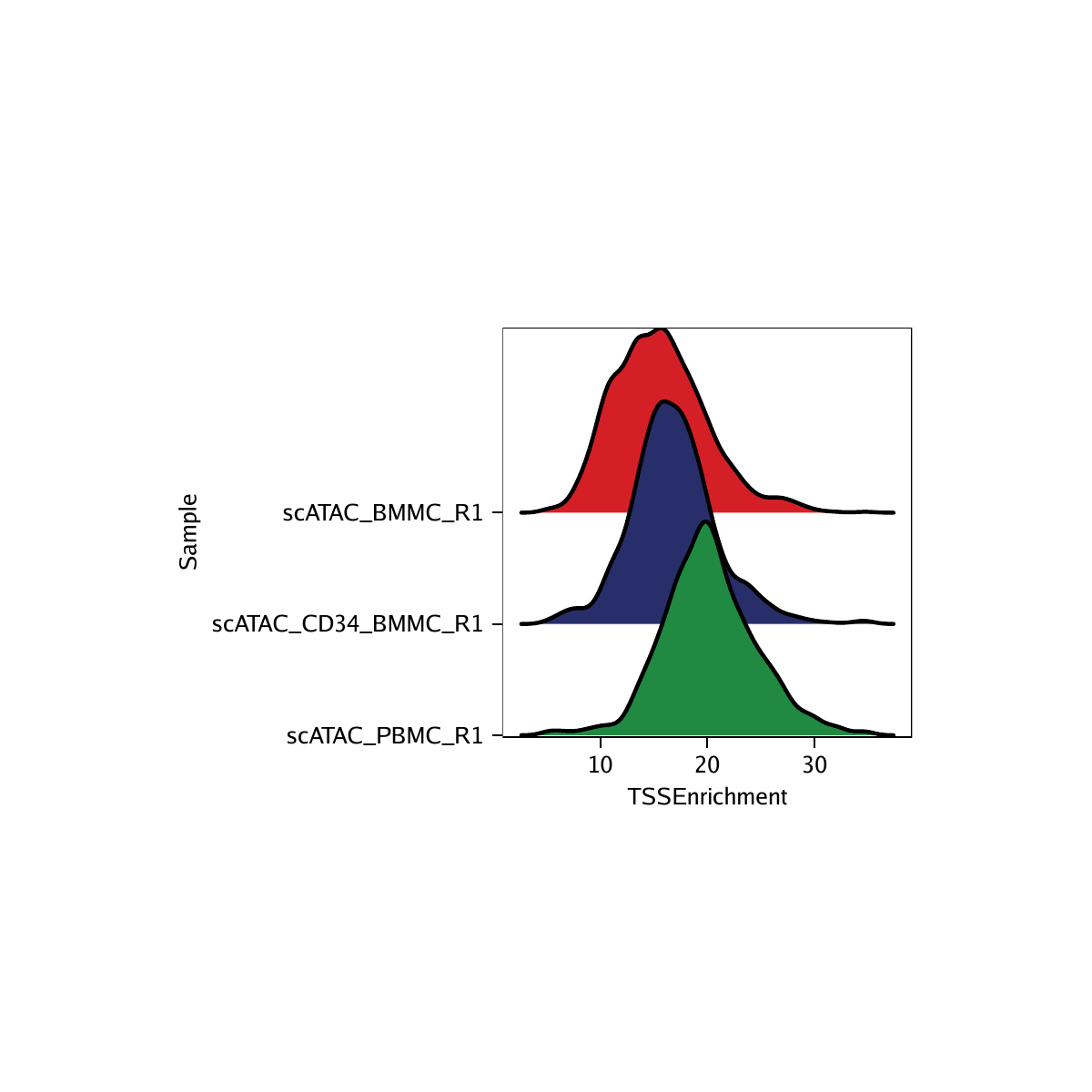
Example 1. Make a ridge plot for each sample for the TSS enrichment scores.
To make a ridge plot, we set plotAs = "ridges".
p1 <- plotGroups(
    ArchRProj = projHeme1,
    groupBy = "Sample",
    colorBy = "cellColData",
    name = "TSSEnrichment",
    plotAs = "ridges"
   )
## 1
## Picking joint bandwidth of 0.882

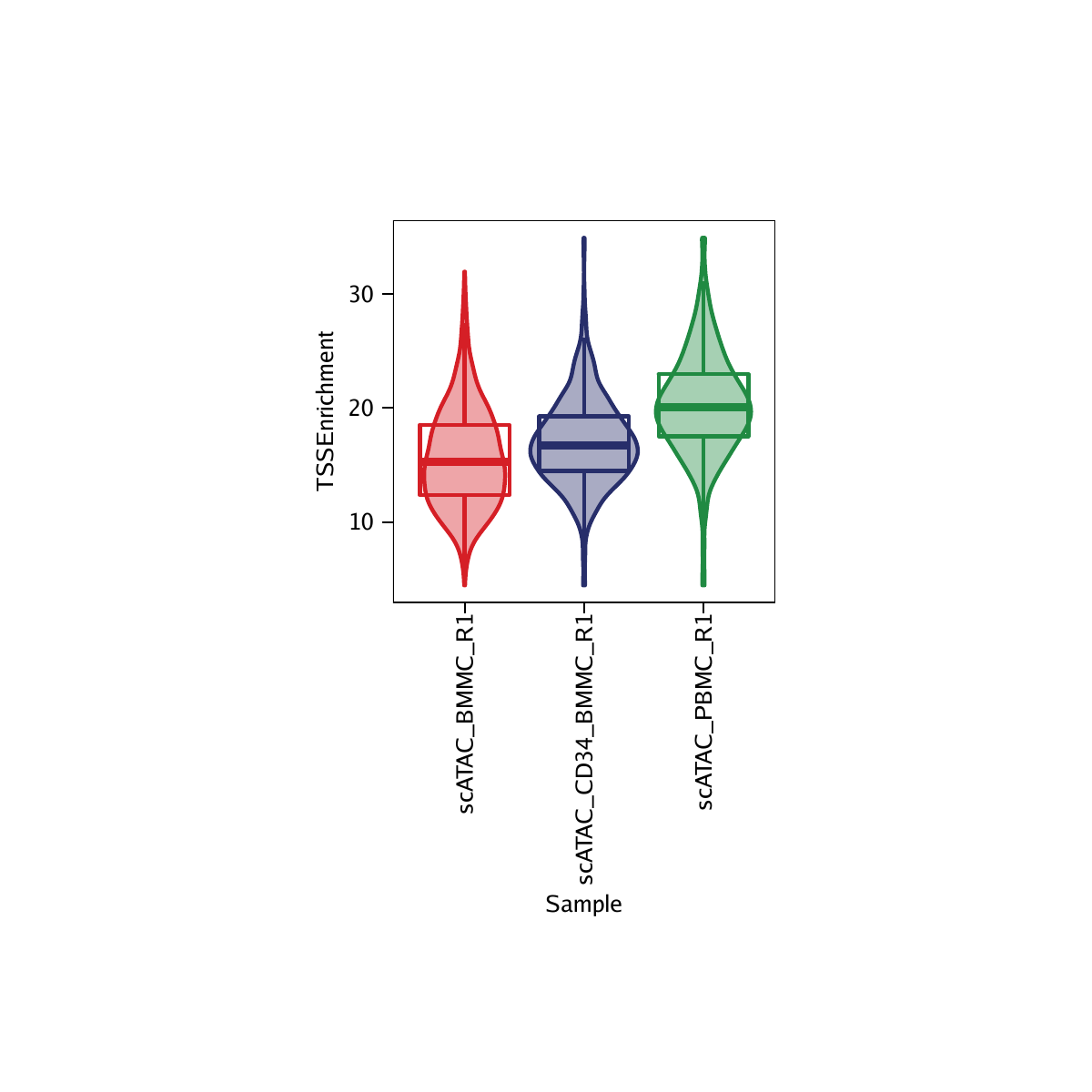
Example 2. Make a violin plot for each sample for the TSS enrichment scores.
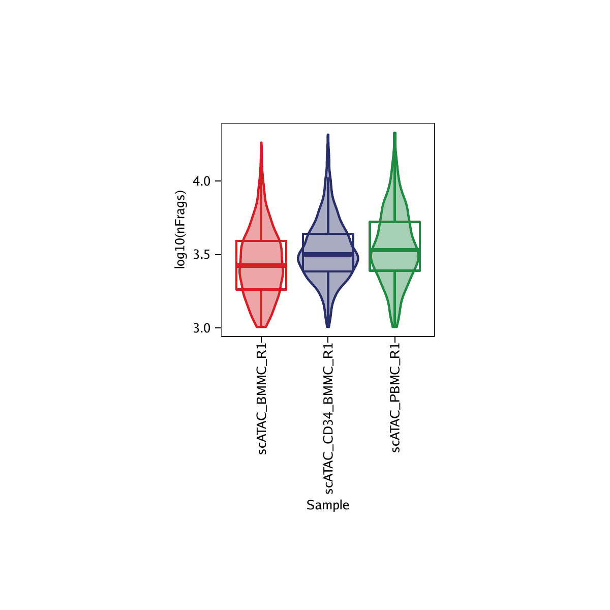
To make a violin plot, we set plotAs = "violin". Violin plots in ArchR come with a box-and-whiskers plot in the style of Tukey as implemented by ggplot2. This means that the lower and upper hinges correspond to the 25th and 75th percentiles, respectively, and the middle corresponds to the median. The lower and upper whiskers extend from the hinge to the lowest or highest value or 1.5 times the interquartile range (the distance between the 25th and 75th percentiles).
p2 <- plotGroups(
    ArchRProj = projHeme1,
    groupBy = "Sample",
    colorBy = "cellColData",
    name = "TSSEnrichment",
    plotAs = "violin",
    alpha = 0.4,
    addBoxPlot = TRUE
   )
## 1

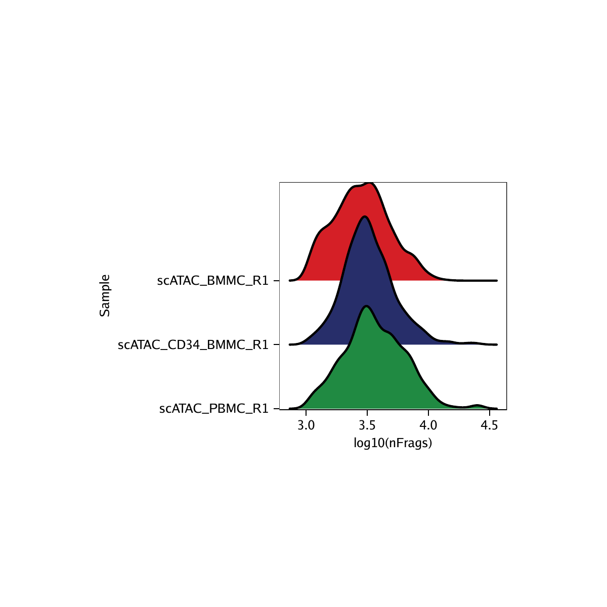
Example 3. Make a ridge plot for each sample for the log10(unique nuclear fragments).
p3 <- plotGroups(
    ArchRProj = projHeme1,
    groupBy = "Sample",
    colorBy = "cellColData",
    name = "log10(nFrags)",
    plotAs = "ridges"
   )
## 1
## Picking joint bandwidth of 0.05

Example 4. Make a violin plot for each sample for the log10(unique nuclear fragments).
p4 <- plotGroups(
    ArchRProj = projHeme1,
    groupBy = "Sample",
    colorBy = "cellColData",
    name = "log10(nFrags)",
    plotAs = "violin",
    alpha = 0.4,
    addBoxPlot = TRUE
   )
## 1

To save editable vectorized versions of these plots, we use plotPDF().
plotPDF(p1,p2,p3,p4, name = "QC-Sample-Statistics.pdf", ArchRProj = projHeme1, addDOC = FALSE, width = 4, height = 4)## [1] “plotting ggplot!”
## Picking joint bandwidth of 0.882
## Picking joint bandwidth of 0.882
## [1] “plotting ggplot!”
## [1] “plotting ggplot!”
## Picking joint bandwidth of 0.05
## Picking joint bandwidth of 0.05
## [1] “plotting ggplot!”
## [1] 0